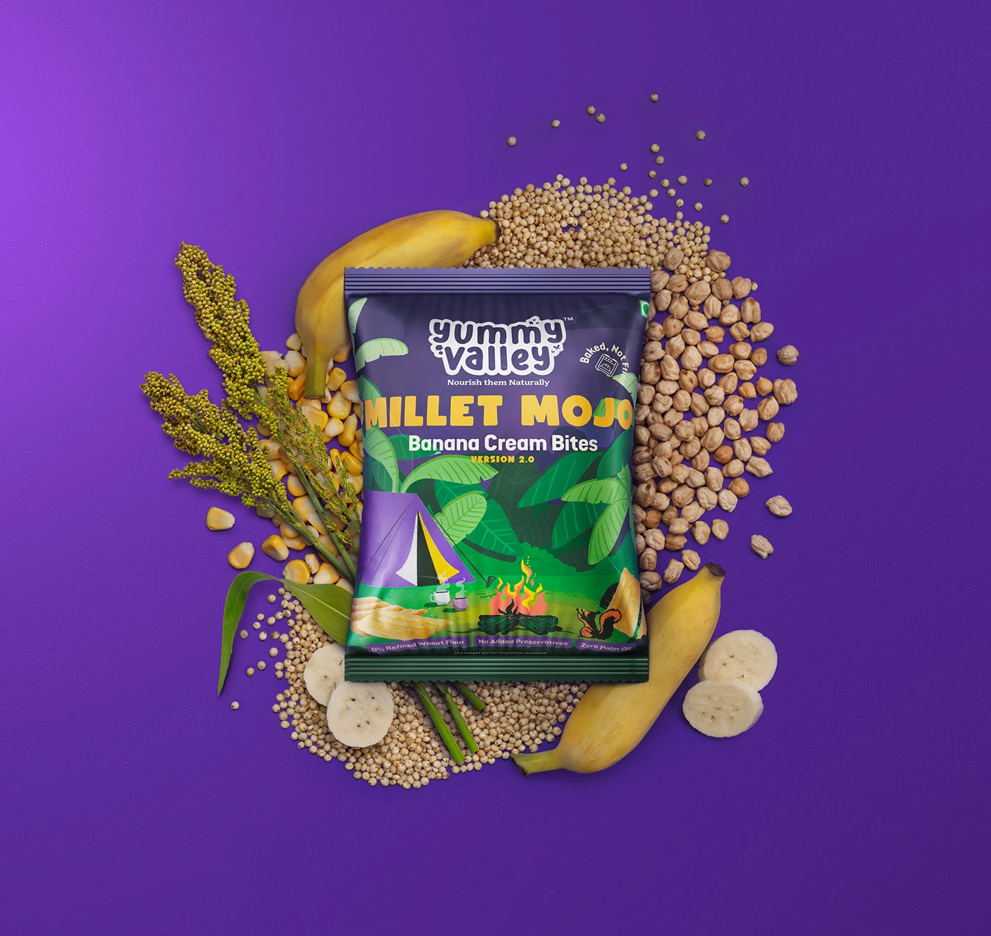
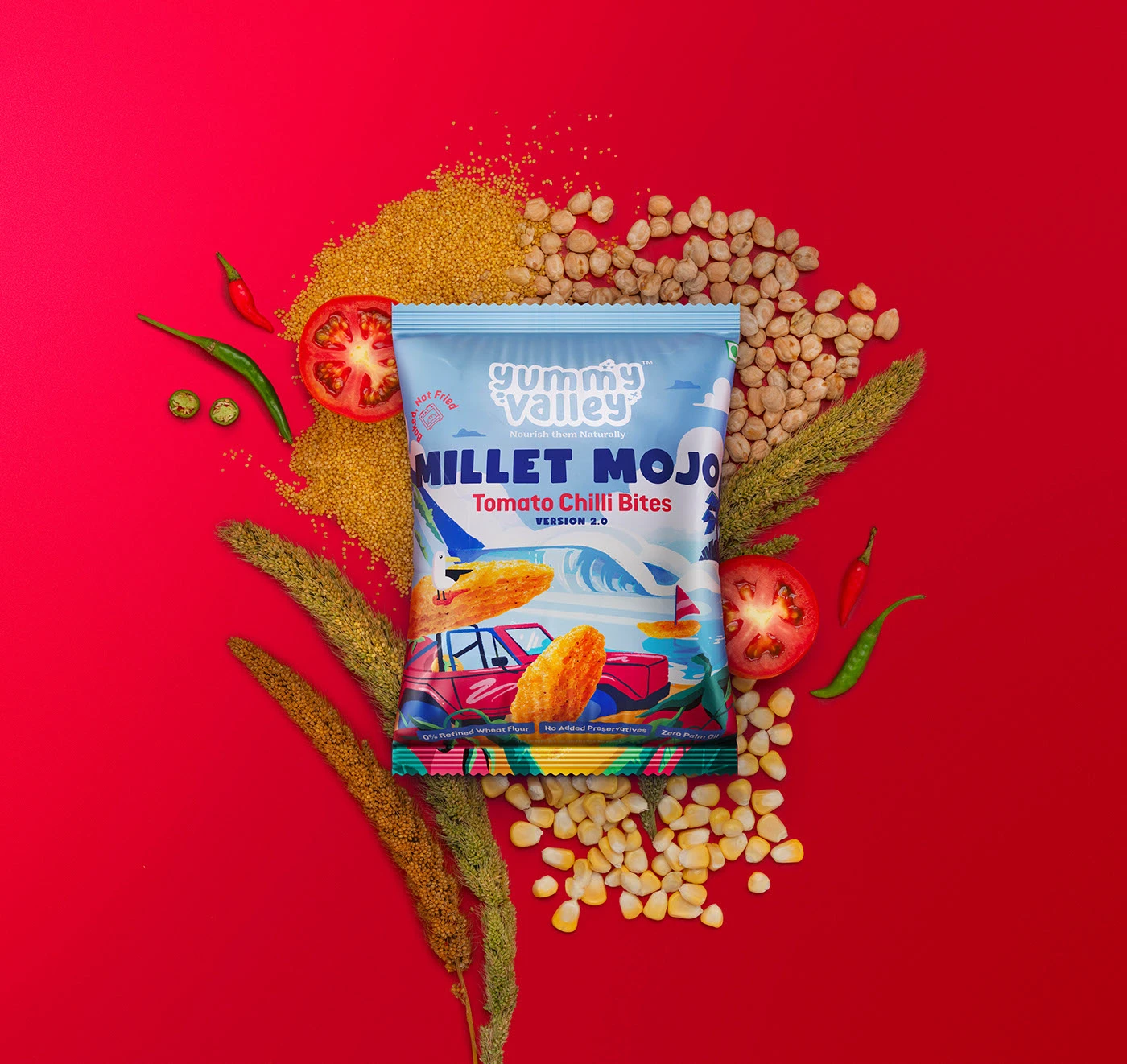
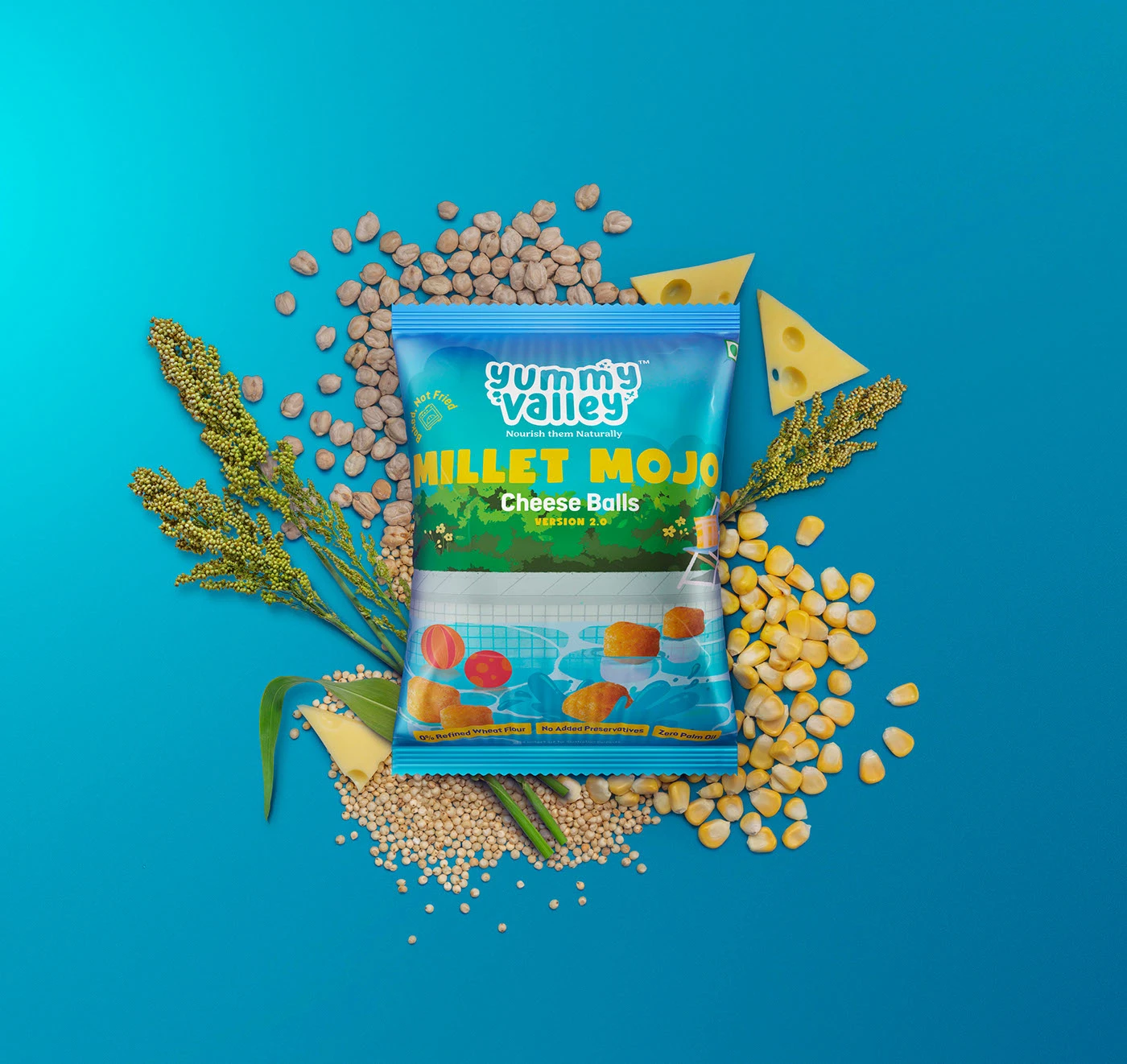
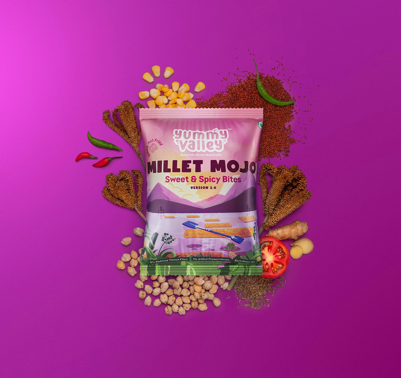
Illustration-led packaging for a health food brand that refused to look like one — then a full suite of campaign imagery that made the pack the hero and the ingredients the story.
Client
Millet Mojo
Role
Creative Direction · Illustration · 3D · Retouching
Output
Packaging Design · Campaign Imagery · Print & Social
Agency
Causate Collective
01 — The Packaging
Illustration that holds the real.
The brief was unambiguous: no clinical layouts, no stock-feeling design. Millet Mojo wanted a packaging world that was entirely illustration-led — characters, textures, and environments drawn by hand — and then the actual product brought into that world. Real bites. Real balls. Photographed, retouched, and placed into the illustration as if they had always belonged there. The result is packaging where the drawn and the real coexist without seam — each element feeding the other's energy.
02 — Beyond the Pack
The pack as hero. The ingredients as story.
Once the packaging was locked and heading to print, the scope expanded. Millet Mojo needed campaign imagery — visuals built to live on social media and in print ads. We built a series of indulgent hero compositions: the pack front and centre, with the actual ingredients — millets, nuts, seeds, bites and balls — arranged around it in a way that felt abundant, tactile, and appetite-first. These weren't product shots. They were invitations.
03 — How It Was Made
Illustration
Every element of the packaging world — characters, flora, textures — was drawn by hand. The illustration gave the brand a warmth and distinctiveness no photograph or render alone could deliver.
3D & Retouching
The real product — bites and balls — was rendered and retouched to sit inside the illustration seamlessly. Precision at every edge, colour-matched, light-matched, print-ready at any scale.
Creative Direction
Two very different disciplines — hand-drawn illustration and high-end 3D — had to feel like one coherent world. Every decision, from composition to colour key, was made to hold that tension together.